
Who loves looking at Pottery Barn catalogs for inspiration? I know I do, and I love looking at the paint colors that are chosen for each space. It’s fun to see how they put the rooms together and how the paint coordinates with the rest of the decor. The spring/summer 2017 palette has some great colors, and today I put together some of the most used and most popular ones to help you get started if you are looking for that perfect color.

I have seen all of these colors in person and multiple times from pictures and they have not disappointed. There is a reason why Pottery Barn has chosen them. They are beautiful and look great in so many rooms and spaces. You can see how they have used the colors in their Pottery Barn catalogs. I have also put together a few inspiration pictures from beautiful homes around the web. Enjoy!

Naval by Sherwin-Williams

Bungalow Beige by Sherwin-Williams

Halcyon Green by Sherwin-Williams
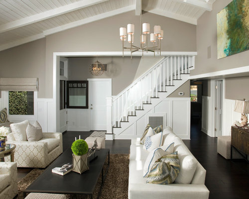
Functional Gray by Sherwin-Williams

I love this model showing Inkwell by Sherwin-Williams and Luxurious Red for the shutters and the door. Red is a great accent color and would also look really good in a room with crisp white trim or molding.
Happy Painting! 
Related Stories
This article is courtesy of http://www.favoritepaintcolorsblog.com
